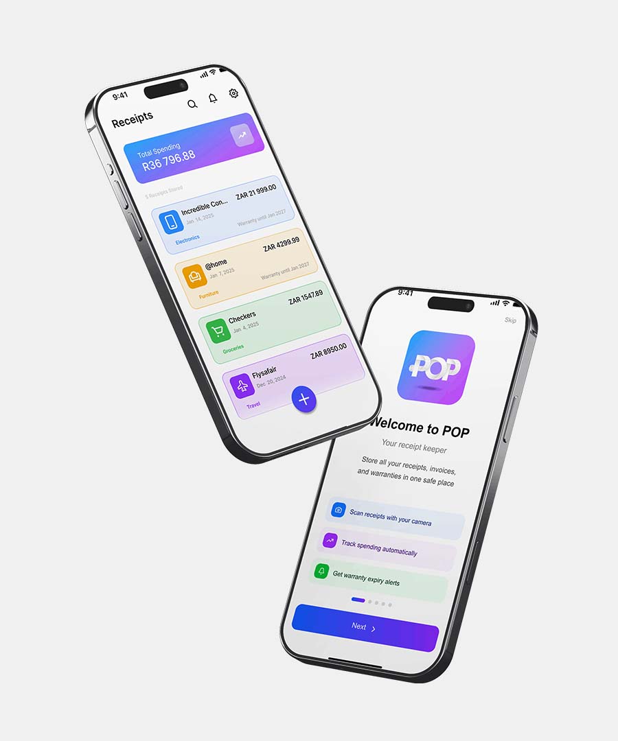
About pop
pop is a product-design framework exercise focused on reusable interaction patterns and a modular UI kit for rapid digital product exploration.
The Problem
Teams were reinventing the same components with inconsistent states, slowing discovery and shipping inconsistent UX across screens.


How might we define a playful but rigorous framework that keeps interfaces consistent without killing creative range?
Our Solution
Build faster. Stay coherent.
Feature 01
Primary flow that solves the core job-to-be-done.
Feature 02
Supporting interaction that improves confidence and speed.
Edge Cases
Recovery and empty states that keep momentum.
The Process: Researching the Problem Space
Qualitative and quantitative signals shaped the product direction.
Patterns in the data pointed to clearer orientation, tighter feedback loops, and safer recovery paths.

Market & Competitive Analysis
Comparing adjacent products clarified gaps and opportunities.
What they do well and where they fall short.

What they do well and where they fall short.

What they do well and where they fall short.

Validating Our Assumptions
Field notes, interviews, and early prototypes tested the riskiest ideas.


Identifying the Pain Points
Evidence mapped cleanly onto the moments where users stalled or abandoned the flow.
Key Insights
Users need faster orientation before commitment.
Feedback loops increase confidence mid-flow.
Recovery paths are as important as happy paths.
Defining Persona & Goals

Maya Okonkwo
Primary — Habit Starter, 28
Works long studio days and wants progress she can feel without opening five different apps. Responds to clear next actions and visible streaks.
Goals — Build a sustainable routine, see weekly momentum, stay motivated after busy weeks.
Frustrations — Habit apps feel punishing after one missed day; progress is hard to read at a glance.

Jordan Ellis
Secondary — Curious Explorer, 34
Tries new challenges for fun but abandons tools that feel complex or guilt-heavy. Needs soft onboarding and low-pressure recovery paths.
Goals — Explore challenges casually, understand the system quickly, restart without shame.
Frustrations — Dense dashboards, unclear first steps, and no forgiveness when life gets in the way.
User Storyboarding
A narrative sequence connecting motivation, action, and payoff.

Brainstorming Requirements
Divergent concepts narrowed into a coherent product direction.


Approaching a Solution
The concept ecosystem answers the brief through three design pillars.
Design Goals
Reduce cognitive load at every decision point.
Keep users progressing with confident feedback.
Make system behavior feel predictable and fair.
Feature Prioritization
Features were scored and sequenced for an MVP that still feels complete.

System Architecture
Flows and journey maps define how structure supports the experience.


Usability Testing & Iteration
Usability feedback drove wireframe-to-UI refinements.


Iteration 01
User friction, fix, and rationale from this test cycle.
Iteration 02
User friction, fix, and rationale from this test cycle.


The Final MVP Product
Core screens from the pop MVP.
Onboarding Flow

Welcome
First session orientation

Permissions
Only what the quest needs

First Quest
A clear first win
Core Action Flow

Home Hub
Progress at a glance

Active Quest
One next action

Reward
Momentum you can feel
Project Takeaways
What held up under pressure — and what we would stage differently next time.
Simplifying hierarchy improved first-session completion.
Depth was staged so the MVP stayed approachable.
Personalization and richer analytics remain future work.
Project Impact
“pop shows how rigorous UX process turns ambiguity into a product people can use with confidence.”